


116 WinView/32 Manual Version 2.4.M
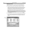
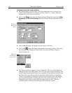
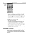
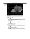
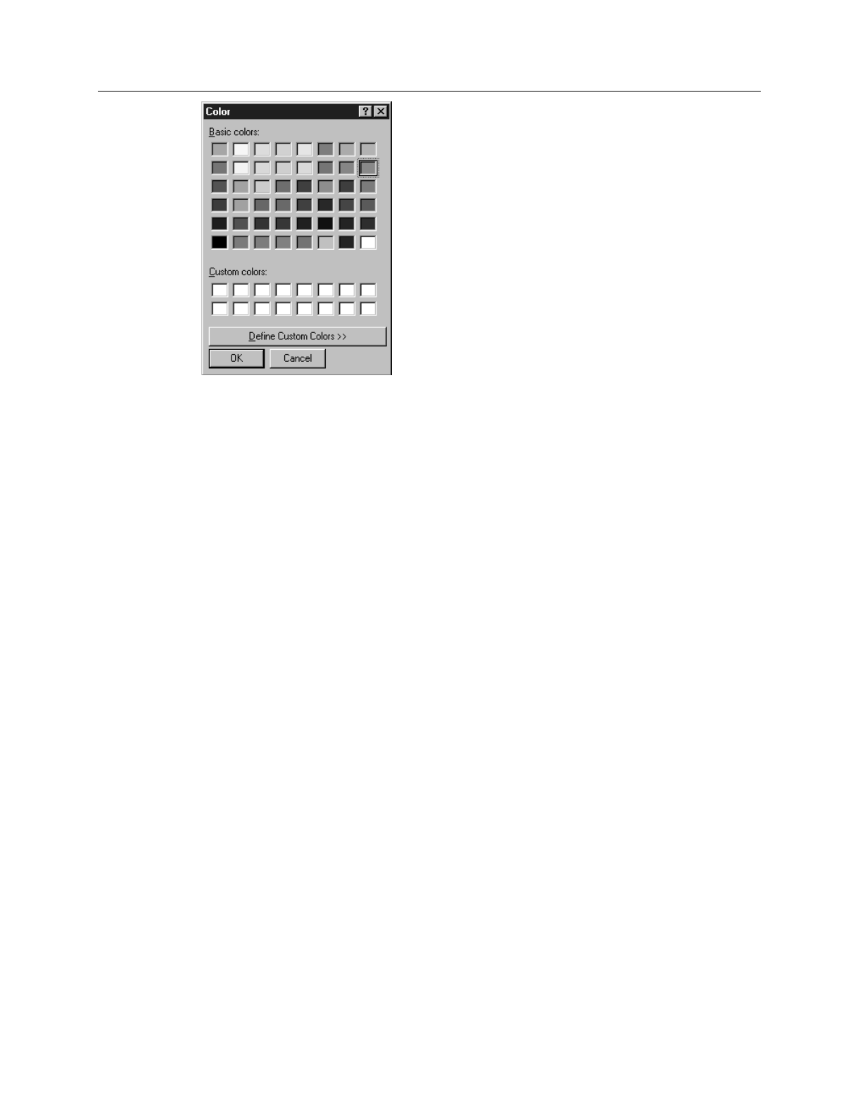
➧ Select a different color by clicking on the swatch of the desired color in the Palette.
Then click on
OK
to close the Palette dialog box and on
OK
again to close the
Display Layout window. The axes and colors will now appear with the new color.
➧ Repeating the process, open the Palette dialog box again and restore the default
color. Again, click on
OK
to close the Palette dialog box and on
OK
again to close
the Display Layout window. The axes and labels will now be displayed in the
original color.
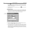
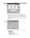
Specifying a new ROI and intensity range
➧ Open the Display Layout Range tab page. Note that you can change the displayed
intensity range as well as the X-Y range.
➧ Try entering more restricted ranges and note how the displayed image changes.
Changing the X-Y range by entering new values is functionally equivalent to
changing the displayed area by dragging the cursor as previously described.
Selecting a narrower intensity range results in pixels brighter and darker than the
range limits being displayed as white and black respectively. The effect is to
increase the contrast of the image. Each time a change is made, click on
OK
to close
the Display Layout window and observe the effect of the change.
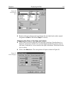
➧ On completing your display experiments, restore the defaults (Autoscale Intensity
and Full Range checked). Last, close the data file.
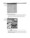
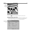
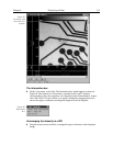
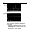
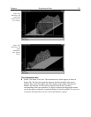
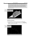
Data Displayed as a 3D Graph
Data files can be opened as 3D graphs from the Open dialog box. Figure 99 shows a 3D
graph with five data strips. Figure 100 shows a 3D graph with two data strips. Both
examples illustrate the behavior of the
Auto-Select
algorithm as discussed on page
107. The following paragraphs contain procedures for opening and displaying data in
graphical format.
Figure 98.
Display layout
color palette.